Bad Example of Window Display
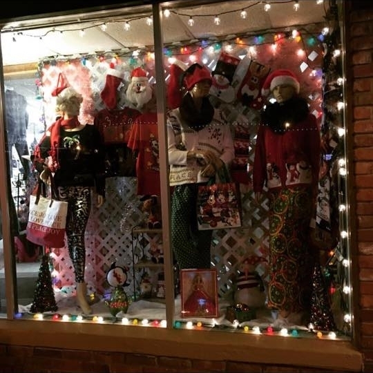
I would consider this window display to be a poor one. Within this display it is difficult for my eyes to focus on just one thing, and there’s nothing included in this display that is appealing. This display is very unbalanced, and it seems they put props in very awkward and random places. There really isn’t one set color scheme included and while texture is being used, there is too much going on. The Christmas lights around the border was a unique idea, but that was the only lighting they used. It doesn’t provide enough light so it is hard to see what kind of merchandise is being sold.
Pages: 1 2
